Introduction
This page will present some guidelines to make your web content readable, accessible, and more useful to students. We will look at some common mistakes, and suggest more usable formats.
A Word About Word®
Microsoft Word® is a very powerful tool that all of us find useful. However, Word is not intended for Web page formatting. For this reason, we ask that you avoid copying and pasting directly from Word. Doing so might produce the same results you see in your document, but it will make undesirable changes to Miramar's branding, and make the page content much harder to edit in the future. Furthermore, such things as Word tables and images are not responsive; that is, they will not display properly on a student's mobile device.
If you have a large amount of text in a Word document, a safer approach is to first copy, then right-click and "Paste As Text" into your web page. Then, use the formatting tools that we provide.
Consistency and Branding
When a student or other user visits the College website, it is important that they know what to expect on each page. That is why all pages on Miramar's website are designed to have a consistent look and feel. Text, links, images, the way information is displayed, should be familiar to a student, irrespective of which department the page belongs to.
Fonts
While it is possible to use different fonts on our system, Miramar College has a list of fonts that we use for the web. We have a font for headings, and one for text. This is done on the server, and you don't need to do anything. We ask that you not use outside fonts (such as those one might paste from Word), because once again, this affects both readability and branding. Some fonts are very difficult to read (the overly popular Algerian); some of the more exotic ones may render differently in a student's browser (not all computers have all fonts available). Furthermore, the fonts Miramar uses on the website are part of the look and feel that convey an impression of the College.
Headings--Begin at the Beginning
What web content editing really is, is the organization of information. That is, your information will be more useful if it is organized in a logical way that will also be easy to read, both on a standard desktop or mobile screen, and using a screen reader program. One very common way to do this, is by presenting related paragraphs under headings.
Web pages have six possible headings. In order of use and from big to small, they go from Heading 1 to Heading 6. The order in which they are used is important, as this is how a screen reader describes the page's structure.
Heading 1 is reserved for the main page title only. It should not be used anywhere else.
Use Heading 2 only if you have a short, important introductory statement pertaining to the entire page.
Here is an example of how headings might be used:
This is Heading 3
The introduction or main point of your information block goes here. Often this is the onloy heading you will need.
This is Heading 4
If you have subpoints or major categories within your topic, you can use headings to make them more readable.
This is Heading 5
If your content requires even more subcategorization, you can use additional headings. The lower level headings should be used sparingly.
This is Heading 4
You may have more than one subpoint. Use the same subheading for everything that is on the same level.
If you have a large number of subpoints and they are short ones (a couple of sentences), consider using a bulleted list instead of a lot of Heading 4's.
Headings should never be centered or right-aligned.
Headings should be as brief as possible, not an entire sentence. If your thought is more than about four or five words, it is better expressed in an emphasized sentence within the text. Headings should be kept to a single line; they should not line-break.
Never bold, italicize, or underline a heading. Headings are already formatted to the College's specification.
When headings are used, they should be to introduce a section only. They should never be used when you want to emphasize a sentence or block of text. See the following example:
The following is incorrect:
Deadlines have changed! See Academic Calendar for details at https://www.sdccd.edu/students/dates-and-deadlines/index.aspx.
Rather than using headings for simple emphasis (which will confuse a screen reader), we use bold, either by itself or in combination with the "Paragraph Bigger" style.
The following are correct, using "Bold" and "Paragraph Bigger:"
Deadlines have changed! See Academic Calendar for details.
Deadlines have changed! See Academic Calendar for details.
- Do use headings to organize the thoughts/topics on a page.
- Do place headings at the top of a thought, topic, or subtopic.
- Do limit the length of your headings (One line only).
- Don't use headings randomly in a page, for simple emphasis.
- Don't use a heading as a link. When you need to emphasize a link, use bold, the Paragraph Bigger style, or a call to action.
Centering
The ability to center text and images on a page can be a very powerful tool for both emphasis and organization. However, it should be used very little.
When in doubt, remember: The standard for content headers and all text content (including lists) is to be left justified.
Centering should be used only for the following:
- Larger images and embedded videos that do not take up the entire content area and occupy one entire line.
- Possibly, important links and/or short informational statements.
The following examples are incorrect:
Lorem Ipsum is simply dummy text of the printing and typesetting industry. Lorem Ipsum has been the industry's standard dummy text ever since the 1500s, when an unknown printer took a galley of type and scrambled it to make a type specimen book. It has survived not only five centuries, but also the leap into electronic typesetting, remaining essentially unchanged. It was popularised in the 1960s with the release of Letraset sheets containing Lorem Ipsum passages, and more recently with desktop publishing software like Aldus PageMaker including versions of Lorem Ipsum.
- Make the flyer available as a downloadable and accessible PDF.
- Format the information on the flyer for web display.
- (Preferable) Do both.
Overuse of centered text is particularly problematic with short bites of information, such as a bulleted list. The "sawtooth" effect of the text is confusing to the eye. Also, as can be seen, centering can have unintended consequences on any other formatting.
The following is more correct:
Lorem Ipsum is simply dummy text of the printing and typesetting industry. Lorem Ipsum has been the industry's standard dummy text ever since the 1500s, when an unknown printer took a galley of type and scrambled it to make a type specimen book. It has survived not only five centuries, but also the leap into electronic typesetting, remaining essentially unchanged. It was popularised in the 1960s with the release of Letraset sheets containing Lorem Ipsum passages, and more recently with desktop publishing software like Aldus PageMaker including versions of Lorem Ipsum.
Note that having a large amount of text centered is confusing to the eye, which naturally reads from one end to the other. The second example is much easier to read. This will become particularly important on a mobile device.
Text In Images
If a department has a well designed flyer for announcements or events, it seems easy to convert that flyer to an image, and use it on the website. However, this is not a best practice.
Consider the following:
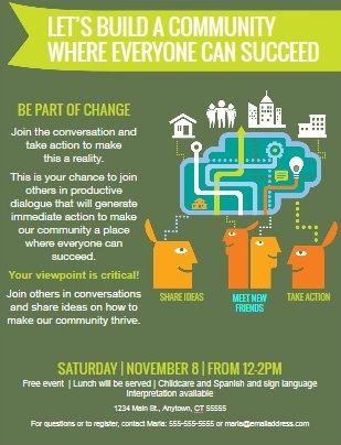
While this is a perfectly reasonable flyer, it cannot be used in this form online. There are a number of reasons for this:
- Accessibility. A screen reader will look at that image and just say "Image" or "Flyer" or whatever is in the alt text. This way, a student using a reader will lose all of the information that the image contains.
- Search. Increasingly, students find what they want by using website search. The information contained in an image of this type is not known to the search feature, and is lost.
- Look and feel. A flyer may contain fonts, colors, images, etc., that are not part of Miramar's branding. This may be confusing,
When information from a flyer is needed, there are a number of ways to accomplish this:
- Make the flyer available as a downloadable and accessible PDF.
- Format the information on the flyer for web display.
- (Preferable) Do both.
If an image with text must be used, the "alt" text for that image should convey the same information. This is not advisable for large amounts of information.
Emphasis
Frequently, you want a few words, a sentence, or a line of text to stand out. The tools we provide for this are bold, Italics, and large text.
This is large text.
Let's look at a few examples.
The following is incorrect:
ALL CAPITAL LETTERS AND/OR MULTIPLE EXCLAMATION MARKS!!!!!!!
Using all caps is not recommended, as once again, it may make the text difficult for some students to read. When using exclamation, a single mark is better punctuation. Exclamation marks should be used only sparingly, in accordance with the rules of business writing.
The following are correct:
New Saturday Sections Added!
All Space Academy students must pass a physical evaluation.
As can be seen a large amount of italics can be difficult to read. Italics should be used rarely and for special purposes (such as the title of a book).
Bold and italic should not be used on the same text, again to increase its readability.
Lists
When you have short, sequential bites of information, lists are often the best way to make them both readable and emphasized. Consider the following:
Apply to Miramar
Assessment Test
See a Counselor
Orientation
This appears to be a series of unrelated thoughts. But when organized into a list:
- Apply to Miramar
- Assessment Test
- See a Counselor
- Orientation
It is readily apparent that this is a group of related information.
Spacing
The spacing of paragraphs, lists, etc., is handled by the website software in accordance with Miramar's official look and feel. Spacing should not be used to separate ideas or to emphasize a block of text.
The following is incorrect:
This is Paragraph 1. It could be the introduction to an idea, a block of standalone information, or anything you would contain in a paragraph.
This is Paragraph 2, a separate idea from Paragraph 1. It can introduce the next topic or be a topic on its own.
This is not efficient use of page space. It creates a large gap between paragraphs, which becomes even larger and more difficult to understand on a mobile device. Instead, consider using headings to separate your ideas.
The following is correct:
This is Paragraph 1
It could be the introduction to an idea, a block of standalone information, or anything you would contain in a paragraph.
This is Paragraph 2
A separate idea from Paragraph 1. It can introduce the next topic or be a topic on its own.
Links
One of the most common tasks is to create a link to another page or website. Following a few easy guidelines will make your links much more likely to be clicked.
Link addresses should be properly formatted.
There are two basic kinds of links: external and internal. An external link is to any online location that is not Miramar; e.g., a page at the District or Mesa, a news website, etc. For these links, you must include the entire web address, as in the following:
https://www.sdccd.edu
Internal links are links to any page on Miramar's website. These should be formatted differently.
The following is incorrect:
https://www.sdmiramar.edu/services/counseling
If you create a link with this address, it will work. However, websites change. When we move to a new website, you may experience broken links. In order to avoid this, for Miramar pages, we use relative addresses.
The following is correct:
/services/counseling
Using relative links will also reduce calls to the Miramar web server, and speed up students' information seeking process.
Links should be properly labeled.
When you create a link, you want the student to know where it goes and why they might need to go there. Link labels should always be meaningful and descriptive.
The following is incorrect:
New sections have been added! Click here
The following is more correct:
New sections have been added! Visit the District portal for more information
This way, a student will know what to expect, and may be more interested in following the link. Most important, instead of just telling a student "click here," a screen reader will now describe what the link is.
Link labels should be brief.
When creating a link, the text that actually contains the link should not be verbose (unless the website has a long name).
The following is incorrect:
Need help? Visit the Counseling page to make appointments, schedule orientations, and get online assistance.
The following is more correct:
Need help? Visit the Counseling page to make appointments, schedule orientations, and get online assistance.
This makes the link more eyecatching--too long of a link label, and it may get lost in the text. Also, a screen reader is far less likely to give a garbled description.
For important links, use a call to action.
You see calls to action all over the web. A call to action is a link, with a very short label, formatted in such a way that someone is invited to click that link. It is a tool for emphasis,
The most commonly used call to action format on Miramar's website is the "Teal Button" style. That is what we will use in the demo.
The following are incorrect:
Apply Now!
Apply to Miramar online--It's Easy!!!!!
Events Online Help Videos More Information
The following is more correct:
- Do use a call to action, rather than headers, when you want to emphasize an important link.
- Do use calls to action sparingly. Too many will blunt your message.
- Do make the text of your call to action short and understandable. Think of an idea that you can get on a bumper sticker, cut it in half, then cut that in half.
- Do put calls to action at the end of a paragraph or thought.
- Do center calls to action. This provides a professional look, and further emphasizes the link.
- Don't use too many calls to action, as this defeats its purpose. A call to action is not a menu.
In Conclusion
These guidelines are not intended to stop creativity. Rather, using them will enable you to craft your pages into a professional and eyecatching product, that will serve and support our students, and reflect well on your department.
Questions?
Website Services is always available to answer questions.